Showing posts with label artists. Show all posts

Monday, March 19, 2018

M.C.Escher

In general, I am used to receiving Escher cards mainly from the Netherlands, but who said they couldn't arrive from the USA too :))


The first card shows Escher's litograph work called "Cycle" dating from 1938. I wonder if the little guy on the card is excitedly running down the stairs to check his mailbox (as Bryon pointed it out :D). I for sure look like this when I actually notice the postman through the window, and hear the sound of him dropping something in the mailbox :))) 


The first card arrived with this fabulous 1983 set of balloons, where on the left side the Intrepid (1861) is shown, a hydrogen gas balloon or aerostat built for use by the Union Army Balloon Corps for aerial reconnaissance purposes during the American Civil War. 
It was one of seven balloons constructed for the Balloon Corps and was one of the four larger balloons designed to make ascensions to higher elevations with a larger lift capacity for telegraph equipment and an operator. It was the balloon of choice for Chief Aeronaut Thaddeus Lowe overlooking the Battle of Fair Oaks. 
On the right side you can see the Explorer II, a manned U.S. high-altitude balloon that was launched on November 11, 1935 and reached a record altitude of 22,066 m. The helium balloon carried a two-man crew consisting of U. S. Army Air Corps Captains Albert W. Stevens and Orvil A. Anderson inside a sealed, spherical cabin.
The two stamps in the middle show regular hot air balloons. Still haven't flown with one, but been wanting to do so if I ever go to Cappadocia, and of course, if my budget allows it at that moment, which I highly doubt, since it revolves around 160 euros... per person, not per balloon :D

There are two other small stamps on the card - the 1c Bobcat from 2012, while the other one is from 1991, showing Cole Porter.
As you could notice, none of these stamps have been cancelled, which is actually way better than what happened with the stamps on the card below...


This is another one of Escher's litographs, titled "Drawing Hands", and was first printed in 1948. It depicts a sheet of paper out of which, from wrists that remain flat on the page, two hands rise, facing each other and in the paradoxical act of drawing one another into existence.


and if you were wondering what was wrong with the stamps, here you go... a pen line all the way from left to right. These kind of people should seriously be banned from post offices or coming nearby ones. This is one of the worst crimes in the résumé of a postal worker, that should be marked in both red and bold. Who had the heart to destroy such a lovely issue of four Coral Reefs stamps issued in 1980. Featured are: the Chalice Coral from American Samoa, the Finger Coral from Hawaii, the Brain Coral from the US Virgin Islands, and the Elkhorn Coral from Florida.
Again we have two smaller stamps. First is the Flag over the Supreme Court issued in 1981, and next to it is a bird stamp from a set of 3 issued in 1991.

Friday, February 26, 2016

Victoria Kirdiy, Russia

Ok, here comes a rather longish post...due to the number of cards...and I consider including this one in the Postcard Friendship Friday cos it kinda feels convenient...

Now, Im sure at least some of you have heard or have come across these postcards designed by the Russian artist Victoria Kirdiy. They are really nice, but I really don't know why I kinda started liking them...added some in my favourites, and before I knew, that's what i ended up getting in the favourites tag on the forum :) I do not collect these (like for example I collect those by Mucha or Escher)...I really cannot explain my actual feelings towards these...probably it is the warmth of the images that attracted me most...and then I realized these cards come with quotes on the back (in Russian, but the sometimes the senders provided translation for me).
There are some like regular characters appearing on the cards...and often the quotes coincide with the image on the card.

So with time, I have acquired a number of these...and I know you may not be a fan of Kirdiy (I do not call myself a fan either), but I believe it is worth to take a look at this post cos of the bunch of Russian stamps...and Russian stamps are among my favourites out there!!


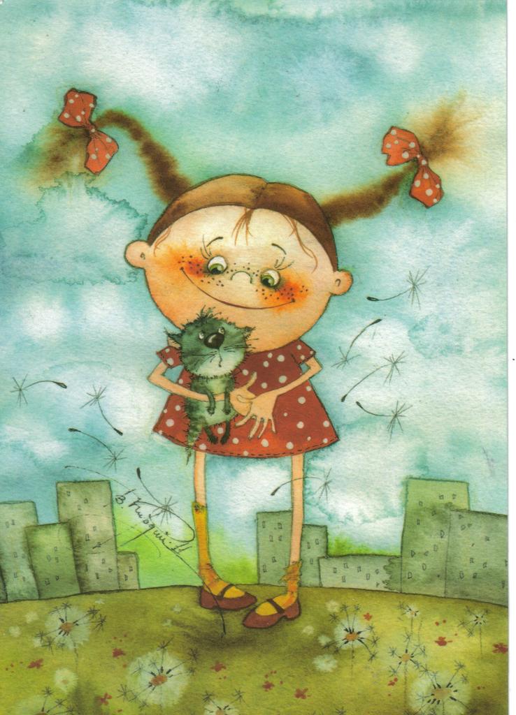
I think this is the first Kirdiy card I received back in 2013


well, the quote on the first one here came without translation....


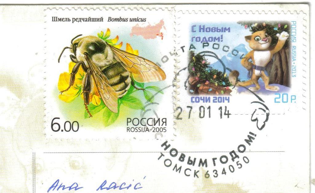
and here we have a bunch of lovely stamps!! Six in total! Starting from the left, first we have a great colourful bumblebee stamp issued in 2005 in a set of 5. Next to it are two small defintiives from 2008, from a set of 15. Next is a lovely rose stamp, issued in 2007 in a set of four flower stamps. Below the rose is a pear, issued in 2003 in a set of five stamps under the name "Gifts of Nature". And at the very right, another splendid stamp with a breathtaking image, issued in 2007 for the International Polar Year (I seem to come across this term frequently lately :P). the issue consists of a sheet of three stamps that together form like one image...on this one here you can see the glacial covers.
Thanks a lot to Ksenia for the fantastic choice of stamps!!


Dear Katya sent me this one as a lovely surprise!!


and she used three awesome stamps! (there is also a special cancellation lurking for the Winter Olympic Games).
On the left we have a fantastic train stamp! It was issued in 2007 in a set of 6 stamps representing Russian Regions (this one represents Irkutsk). The one in the middle was issued in 2007 as well, commemorating the year of the Russian Language. The one on the right was issued in 2006, a joint issue btw Russia and Armenia, commemorating the Year of Armenia in the Russian Federation.


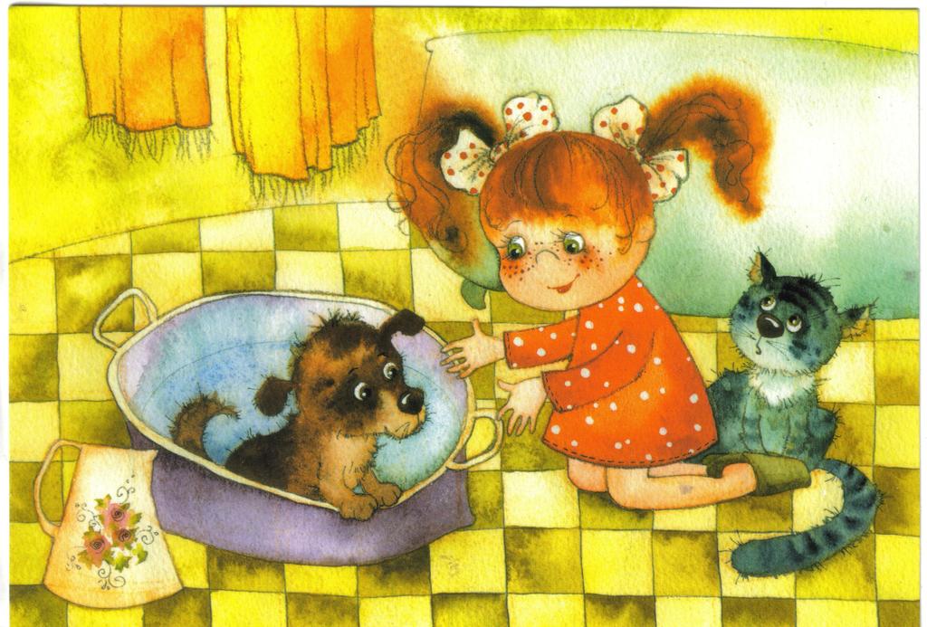
a card I received from Olga...I love the fox represented as a pet here, instead just another women fashion detail.


two awesome horse stamps! (that at the very top is not a stamp, just part of the sheet :))
Issued in 2007 in a set of four stamps with Domestic Horses...I am not a horse specialist, so all I can say is that here we have the breeds of Orlovskaya and Donskaya.
At the left there is also a small stamp issued in 2009 in a set of two, representing symbols of Moscow and St. Petersburg.


oh yeah, a translated quote at last! :)
"The trick is in what one emphasizes. We either make ourselves miserable, or we make ourselves happy. The amount of work is the same" - Carlos Castaneda

This one arrived thanks to Masha!


she used two of the 2008 definitives.


Another one from Masha, with a quote by Pam Brown.
"One small dog changes coming home to an empty house, to coming home"
Boy, this is just so true (I wouldnt underestimate cats here too...)


here we also have two of the 2008 defintiives. And also, in the middle we have a stamp issued in 2004 - it is a set of four stamps showcasing Russian Silverware, with this one showing a vase from 1880s - 1890s. At the right we have a stamp issued in 2006 in a set of two stamps, commemorating the 150th Birth Anniversary of M. A. Vrubel - a Russian painter. This stamp represents one of his works under the title - Tsarevna - Swan.


"I wish you happiness! Fragrant as a ripe cherry, and hot as a morning coffee"!

From Masha again :)


Four definitives from 2008.


This one has a quote by Robert Anson Heinlein - "Women and cats will do as they please. And men and dogs should relax and get used to the idea".

Hhahahahhahahaa! Oh well :D


another of the bumblebee stamps here. And also one from the four New Year stamps issued in 2013, also bearing symbols from the Olympic games in Sochi.
Thanks to Anna for this one!


a very cute winterish scene!!


a nice special cancellation for the Sochi Olympics from the town of Voronezh. And another stamp from the New Year one mentioned above. As well as one from the 2009 definitives representing the Russian Kremlins. (here is the Rostov Kremlin)


one more from Masha! :) And a quote by Anne Lamott.
"Lighthouses don't go running all over an island looking for boats to save; they just stand there shining."


And to complement that quote, Masha used two awesome lighthouse stamps! The middle one is from the set of 3 issued in 2005 (this stamp shows the Mudyugsky lighthouse. The other lighthouse stamp is from the set of 3 issued in 2006 (this one shows the Lighthouse on peninsula Rybachiy, 1966).
and also there is one definitive from the 2008 set.


And just one more of these Kirdiy cards...I received this one like last week or so...but there is no quote on the back...and in fact, the whole backside of the card differs from the ones previously shown....my guess, it is printed somewhere else..
The thank you goes to Olga for this one!


Olga used one of the Kremlin definitives - the one in Ryazan. She also used a definitive from the set of 11 issued in 1998 - this one shows a radio mast. And we have a New Year stamp from 2005. That bear is actually a sticker, not a stamp :)


Hope you are not sick and tired of Kirdiy now :)

Tuesday, December 15, 2015

M.C.Escher

In the end I'll share with you two more surprises (that's what happens when you dont do swaps or officials), with these two fantastic Escher cards sent by Alvin. I still need to get to that Escher Museum in the Hague though....


The first card shows Escher's woodcut in red, black and grey, called "Horseman" from 1946. This seems to be built on a translation but that is only applicable to the white horses or the brown horses if taken alone, and not to both. Upon closer inspection, the brown horses are actually a mirror reflection of the white horses, and this takes place along a vertical axis. This combines to form a glide reflection
The parade of red and grey horsemen – with the grey horsemen moving to the left and the red horsemen travelling to the right – form a tessellation in the centre of the piece. The grey horseman is depicted against a red background and the red horseman is depicted against a grey background. Or, as Escher puts it in his Phoenix article: “as if it were a woven fabric: the “pattern” in the foreground has the same colour as the “background” on the reverse side, and vice versa. The two form a closed circle.


The second one is a woodcut print called "Other World" (or also, "Another World"), dating back from 1947. It depicts a cubic architectural structure made from brick. The structure is a paradox with an open archway on each of the five visible sides of the cube. The structure wraps around the vertical axis to enclose the viewer's perspective. At the bottom of the image is an archway which we seem to be looking up from the base, and through it we can see space. At the top of that arch is another arch which is level with our perspective, and through it we are looking out over a lunar horizon. At the top of that arch is another arch which covers the top of the image. We are looking down at this arch from above and through it onto the lunar surface. Standing in each archway along the vertical axis is a metal sculpture of a bird with a humanoid face. In each side archway is a horn or cornucopia hanging on chains. It is interesting to note that the views from above and below are consistent, placing the statue so that it faces the horn, however the horizontal view reverses the relative positions of the statue and the horn, and rotates the horn 180 degrees.

My brain is not really wired to understand Escher, but that doesn't prevent me from admiring his work!

And here I would like to mention that thanks to one of the experts I was working with during this project, Ron, a lovely Dutch man (and I'm really gonna miss both him and his wife), I have my Escher calendar for 2016! Yes!! You can't even imagine the thrill I felt when he gave it to me!!


You can see that the Horseman is also featured here for November 2016! =)


Thanks a lot lot lot to Alvin for all the surprises this year, and he never ceases to add something to my Escher collection! And thanks so much to Ron and Agnes for the calendar and for all the great moments in the past two years! I'll really miss you guys!

And to all of you, thanks for dropping by! Until next time...stay warm! Hugs to all!!

Sunday, April 8, 2012

Still Life and Street, M.C.Escher

Well, Escher is one of my new discoveries...more precisely since last summer in when i accidentally got the chance to watch this video representing his works....i think my eyes were glued to the screen about how cool it was. I fell for the mathematical preciseness of his works and found it unbelievable in a way.


So I was sooo excited when recently i was asked for a swap, and found Escher cards to choose from! I have two so far, and two more should be coming, so im really really happy! If anyone has Escher cards for swap, please contact me! :)

This image here is called Still Life and Street and is Escher's first (woodcut) print of an impossible reality, dating back from 1937. His artistic expression was created from images in his mind, rather than directly from observations and travels to other countries.
This image is a classic example of Escher’s plays on perspective. In it, the horizontal plane of the table continues into the distance to become the street, and the rows of books on the table are seen to lean against the tall buildings that line the street.

And as for Escher, he was a Dutch graphic artist known for his often mathematically inspired woodcuts, lithographs, and mezzotints. These feature impossible constructions, explorations of infinity, architecture, and tessellations.
His real name is Maurits Cornelis Escher, but you will often find him as M.C.Escher, or simply Escher. A genius.